What opportunities are available in your area?
There are a good number of magazines and zines to submit work to, my particular favourite being the Plymouth Student. They are always asking for work and the paper is widely available and free, so I would be quite well exposed to the Plymouth community.
There are several competitions around to enter as well, most with the prize being published. These are brought to my attention by peers, lecturers and the Creative Opportunities email sent out to all PCAD students.
What skill sets are needed for this area?
Good time management, flexibility and endurance are all needed in the illustration world. A willingness to better yourself and your craft, and to be able to deal with critical feedback. A wide range of influence and inspiration to get you motivated to work and push it further. A sense of healthy competition with other students and illustrators. Technical skill and knowledge of what materials and style would be reasonable for the client or brief. Good quality materials to work with and a passion for the creative process. A confidence and assertiveness to be able to talk and deal with clients
What skills do I need to acquire?
The motivation to carry on working after looking at others work which I deem better than mine. Sometimes it is hard to get over the jealousy I get after looking at work I deem myself unable to be able to create. I have to remind myself that I am sometimes not yet at a level of professionalism and that I will only get better with time and practise.
I also need to be confident in working with digital processes and to push myself out of my comfort zone. I can do this by lessons I can teach myself by online tutorials and magazines. I also need to look at other artists that work in different ways with different styles, and look at their blogs to see how they have produced their work.
List and explain 3 pathways to utilize self promotion in developing a portfolio.
Diversity:
Work with several different clients that require you to change method and style so you have a broad range of work. Push yourself to create things out of your comfort zone and work on the areas you find difficult. However do have some continuity in your work so a style can be seen and that your work doesn't look all over the place.
Saturation:
Promote your blog online and physically. Keep posting the URL on your blogs and social network sites. make it clear you are an illustrator and you are constantly producing new and exciting work. Keep submitting and entering competitions, attending events where there will be like minded people. Don;t be afraid to ask. And always be enthusiastic about your work and show your passion.
Format:
have a well presented physical portfolio in a good case that doesn't just hold but enhances your work. Keep a well designed and up to date blog or website with a memorable name. If working in 3D use a high quality camera to photograph it so it does not take anything away from the work. Print the photograph to a highquality as well for the physical portfolio.
Thursday, 12 January 2012

Thursday, 8 December 2011
Two Colour...


At top are original drawings divided into colours. I was really impatient with "registering" the paper and such, so approached it in a much more touch and go way.
Screen printing never goes perfect, but some of the imperfections make it look pretty damn cool. I really like the print onto some old paper from a book, really into found paper at the moment. Shame the print wasn't great.
I had fun though, as I always do. Hope to do more of this in the future.
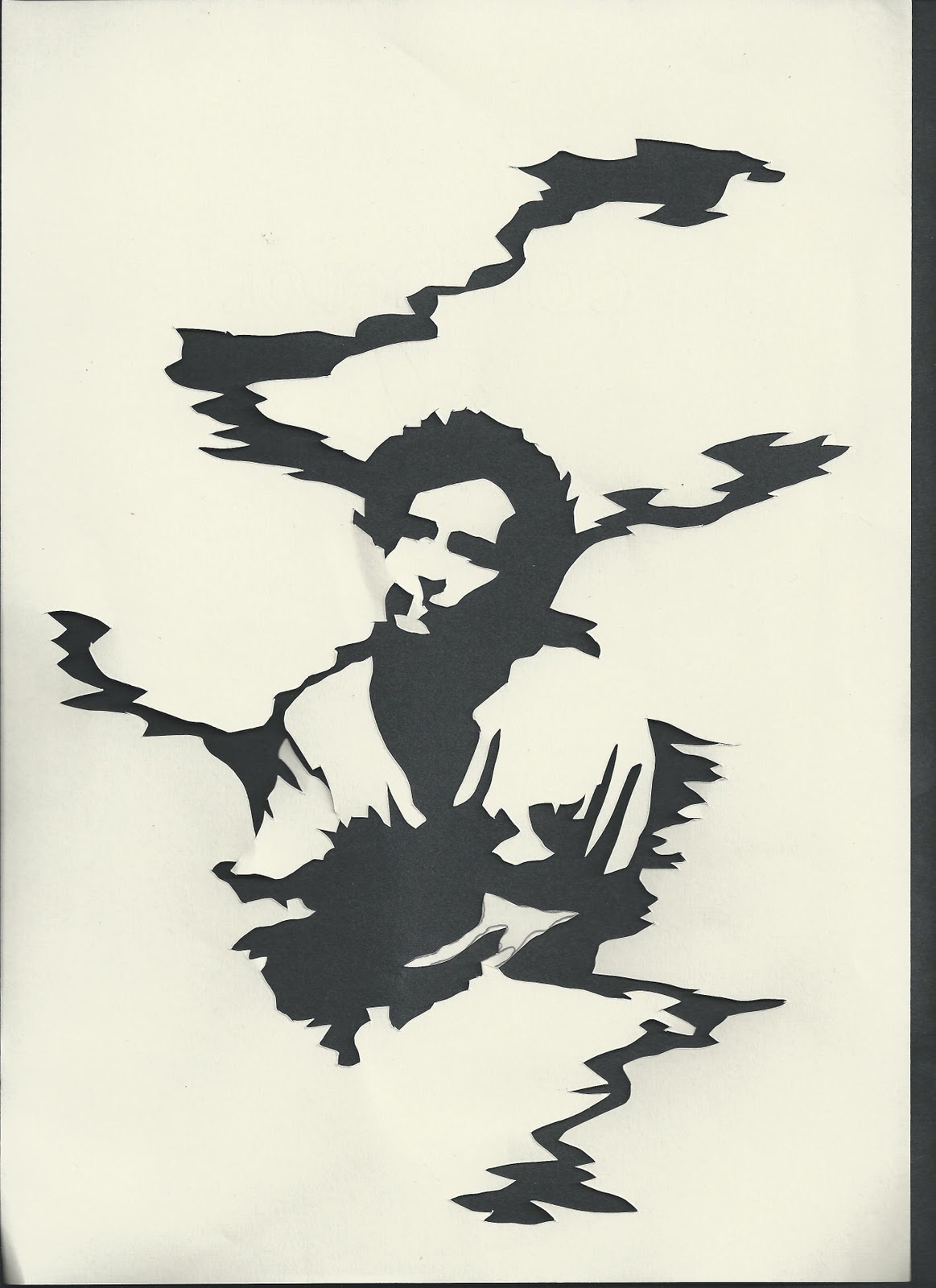
Ghost Portraits Development and Final Piece
Development drawings and paper cuts for the Ghost Portraits project.
At the bottom is my final portrait.
Really enjoyed this project, creating images of such a great man.




Finally...


Final outcome for Ghost Narratives Project, 2 colour screen print. The background was created by haveing numerous colours on the screen before printing, hence the marble effect.
Happy with the outcome, but wish the actual print was a little more crisp, mustn't use as much ink next time!
Monday, 5 December 2011
Christmas Promotional Card
For Work Based Learning, a 16cm x16cm promotional card to hand out at Christmas Fairs, showboating our style and talents.
I had to do a moody Santa, it seemed the only reasonable explanation.
Creating using inks, watercolours and fineliner pens, i got really stuck into this one and enjoyed, especially all the line work in the beard.
I wanted to add a few red or green specks on by flicking ink on it, but i was too scared to ruin the image. May print it off and experiment on the back up.
Not much information on this one as a hypothetical card, under the right eye is my initials and under the left the initials of a small clothing line I started with my friend Charley Roux,
Devils Punch Bowl Clothing.
Check us out on our snappy website
Very happy with this, feel a definite need to start exploring more with colour.

I'm quite fond of how the overall work sheet looks at the end too.
I've always liked the test brush marks on the page when using watercolours.

Catching You Up With Print Processses.
Finally got around to scanning in a few things from print processes.
To refresh your memory, here is the drawing i did from out of my window...

...And here is the intaglio I printed from an etching into plastic. I much prefer this to the original drawing, it has a darker tone now due to the smudging and a little more depth. I'm glad i put some more dark by means of the sky, it feels a little more finished now.

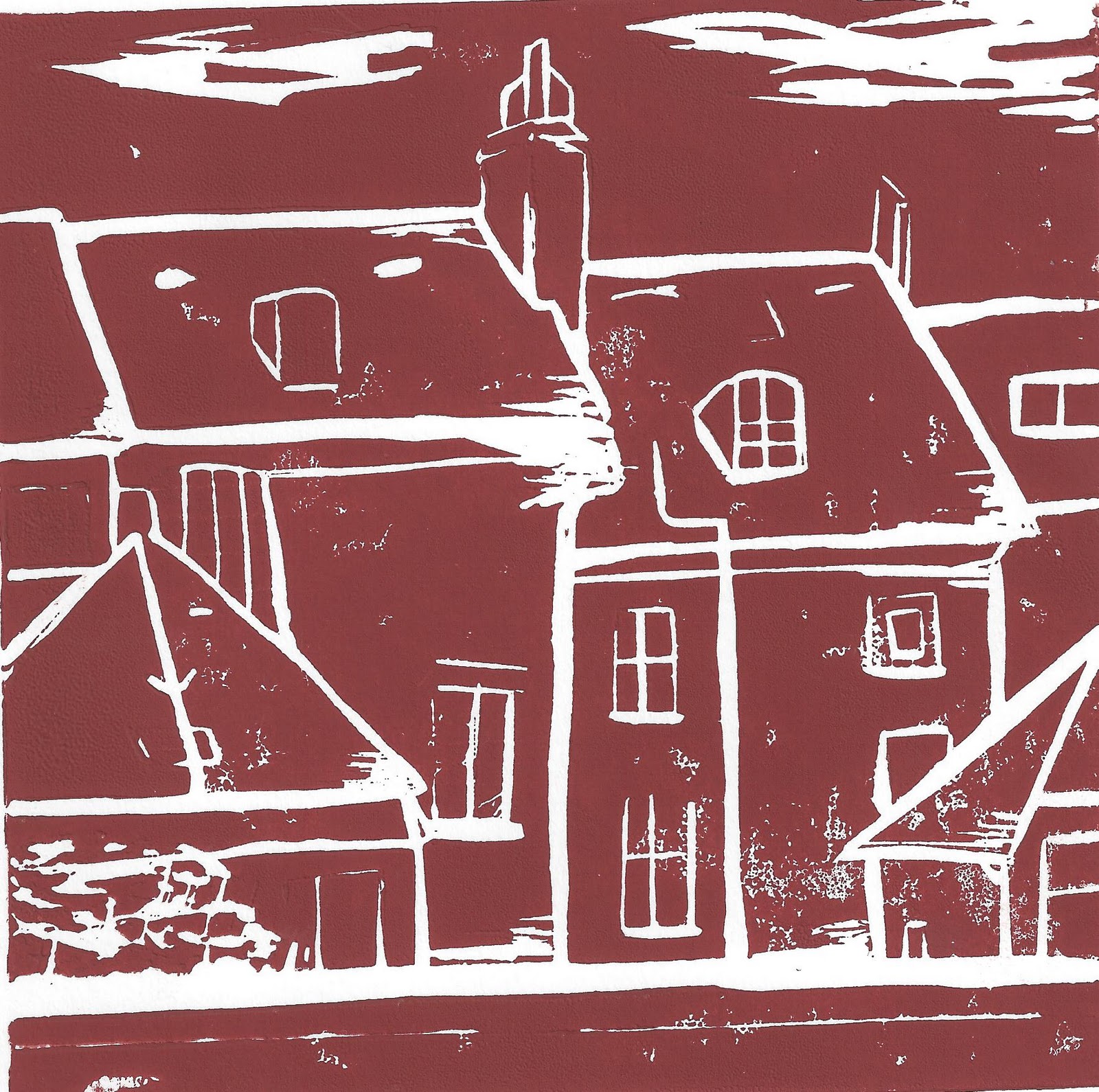
Not so successful however was my lino. I had drawn the image with etching in mind, and knew that it would be hard to get the minute detail into a lino cut. I picked a small section and got to work, and did it in negative so i would have something different to the etching.

As you can see there is a lot less detail than in the cut, and a little too much ink got into the lines. next time I'll know to draw a simpler image...
Here is a very flattering image of my housemate Billie, which may or may not be changed into a two colour screen print. This is the second attempt as in the first the leather jacket was, frankly speaking, terrible. Most of her friends can tell instantly it's her, which may be a little concerning...

No one is spared though, not even myself. Below are some self portraits, which again may or may not become 2 colour screen prints. I got annoyed at not being able to draw realistically straight off the bat, i have to really get myself into the mindsight. So I drew myself grotesque and dripping with black ooze. I look a little like the Hulk...

More to come soon, will do more self portraits that will be better suited to dividing up between colours.
Sunday, 4 December 2011
Back to the play school...
Woke up, started working, 10 hours later i am finished. I produced 3 intricate pieces today but this is by far my favourite. We have to illustrate the song "Song to the Siren" by Tim Buckley, well actually, we have to tell the story of what happened to the sailor after the song.
My story was that he tattooed himself aboard his ship with a needle and ink so the story of what he went through would one day be found.
There are some obvious symbols from the lyrics, plus more obscure tattoos, for example the Roman Numeral V on his right arm is there because the song is the fifth track on the album.
Coming up with all the seperate tattoos took a while, not to mention actually drawing them.
I've wanted to do a push pin model for quite a while now, so was glad I could use it in this. The only problem is is that we have to provide a digital version of our work, so we'll see how well he scans before he becomes the final piece.
I'm pretty proud of him.
And yes, I know he looks like something from South Park...


Here are the lyrics to the song...
On the floating, shipless oceans
I did all my best to smile
til your singing eyes and fingers
drew me loving into your eyes.
And you sang "Sail to me, sail to me;
Let me enfold you."
Here I am, here I am waiting to hold you.
Did I dream you dreamed about me?
Were you here when I was full sail?
Now my foolish boat is leaning, broken lovelorn on your rocks.
For you sang, "Touch me not, touch me not, come back tomorrow."
Oh my heart, oh my heart shies from the sorrow.
I'm as puzzled as a newborn child.
I'm as riddled as the tide.
Should I stand amid the breakers?
Or shall I lie with death my bride?
Hear me sing: "Swim to me, swim to me, let me enfold you."
"Here I am. Here I am, waiting to hold you."
I did all my best to smile
til your singing eyes and fingers
drew me loving into your eyes.
And you sang "Sail to me, sail to me;
Let me enfold you."
Here I am, here I am waiting to hold you.
Did I dream you dreamed about me?
Were you here when I was full sail?
Now my foolish boat is leaning, broken lovelorn on your rocks.
For you sang, "Touch me not, touch me not, come back tomorrow."
Oh my heart, oh my heart shies from the sorrow.
I'm as puzzled as a newborn child.
I'm as riddled as the tide.
Should I stand amid the breakers?
Or shall I lie with death my bride?
Hear me sing: "Swim to me, swim to me, let me enfold you."
"Here I am. Here I am, waiting to hold you."
Subscribe to:
Posts (Atom)